Developing a dedicated website for your museum is vital these days to draw ever-larger visitor numbers and boost sales. In 2022, there were 4.95 billion Internet users worldwide1, and 60.9 million in France2; two figures that are steadily rising and which indicate an almost universal integration of the Web in all consumption patterns. More specifically, mobile phones have become the main device used to connect to the Internet, representing 75% of usage in mainland France in 20223, i.e. five times that of computers. On a global scale, we’re talking about 5.31 billion mobile Internet users over the same period4.
Choosing a ‘responsive design’ website is a must when it comes to meeting the needs of your Internet users. In concrete terms, this means that your website can automatically adapt to the size and resolution of any screen: desktop, smartphone, tablet, connected TV, etc., thus guaranteeing optimal viewing for all your audiences… and much more! Find out more about the 3 reasons to build or revamp your museum website using a responsive design approach.
A smoother, sleeker and more professional user experience guaranteed
User experience (UX) refers to the quality of an Internet-user’s experience when browsing your website. Is it user-friendly, hassle-free and fast? What do they think of your graphic design, your content, your online purchasing pathway? Etc. The concept of user experience encompasses the way in which your website is perceived, based notably on its ergonomics. This typically includes how well it adapts to all types of screens.
Remember to keep in mind that a discovery and purchase pathway can combine several devices. An Internet user may want to find out more about your current exhibitions on a computer, look up visitor reviews on a tablet and book tickets on a smartphone. That’s why your website’s display (blocks, texts, columns, images, etc.) need to be able to adjust in order to maintain optimal legibility and comfort when browsing. Responsive design is a design technique that enables this content adaptation without detracting from quality, notably in terms of pixel size, colours and aspect-ratio for each element on your site. These data are then automatically sent to each device and adjust to the dimensions of your screen.
Here is an example of a non-responsive web display to give you a better idea of what we mean:

Here, an Internet user using their smartphone or tablet has to constantly zoom and drag their screen in order to be able to read the text clearly, access the various call-to-action buttons and any other information inevitably obscured. So they are much more restricted in terms of comfort, which can in no way lead to a positive user experience.
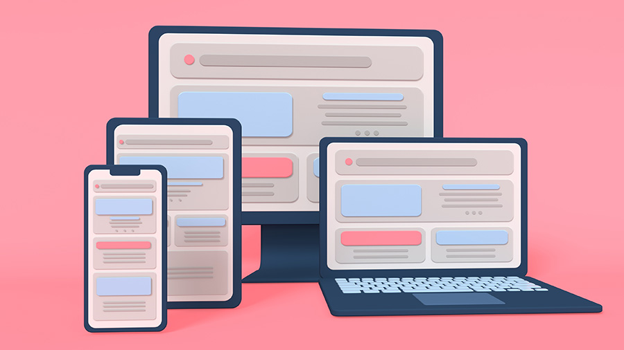
As an example, here is the equivalent responsive design display:

The website content adapts perfectly to the three screens, giving a professional and modern look right away.
Greater appeal as well as customer loyalty and retention
While 57% of Internet users say they would not recommend an organisation if its website does not display correctly on a mobile phone5, it only takes an average of 0.05 seconds for them to form an opinion about your website and determine whether or not they want to continue to browse6. It’s therefore clear that choosing responsive design means giving all your visitors the same level of access to your website content, thereby demonstrating that they are each given the same consideration; a good first impression, in other words, which will boost your credibility and your e-reputation!
Making them both functional and accessible to the broadest possible audience using a responsive design approach makes the different services available on your museum website more attractive; e-ticketing office, e-commerce site, blog, collections portfolio, etc. Enhancing your site’s accessibility also reduces your bounce rate (percentage of Internet users that leave your interface after having viewed a single page) and automatically increases your online conversion capacity tenfold. Your digital, marketing and sales strategies will also be naturally strengthened as an indirect result.
Much more than a simple design detail, a responsive website is a driver for competitive advantage which can also help you stand out against your competitors using a static interface.
Improved SEO for your museum
Search engines suggest the most relevant web pages to Internet users based on the queries they enter, using a list of pre-defined criteria. The increased use of smartphones (and other devices) has led them to include design compatibility in their index. The reasoning being, why continue to suggest non-responsive pages to increasing numbers of mobile users? These pages may be high quality and seem to answer the mobile-user’s query, but if they are not responsive (and are therefore difficult to view on a mobile), they are pushed to the background in search engine results.
As previously mentioned, smartphone and tablet users will not stay on your website if it is not correctly adapted to their screen. This will consequently cause your bounce rate to worsen and have a negative impact on your SEO (given that this indicator is taken into account by search engines). That said, remember that simply developing a website using a responsive design approach will not revolutionise your natural referencing if your SEO optimisation is not exhaustive and not regularly reviewed and updated.
The good news is that most website publishers offer responsive design solutions.
[1] https://www.blogdumoderateur.com/30-chiffres-internet-reseaux-sociaux-mobile-2022/ [2] https://wearesocial.com/fr/blog/2022/02/digital-report-france-2022/ [3] https://www.mediametrie.fr/fr/lannee-internet-2022 [4] https://www.blogdumoderateur.com/30-chiffres-internet-reseaux-sociaux-mobile-2022/ [5] https://www.jolabranding.com/post/web-design-statistics [6] https://www.sweor.com/firstimpressions
